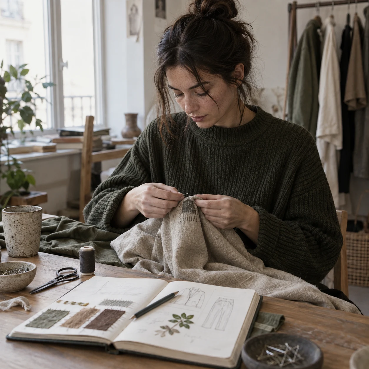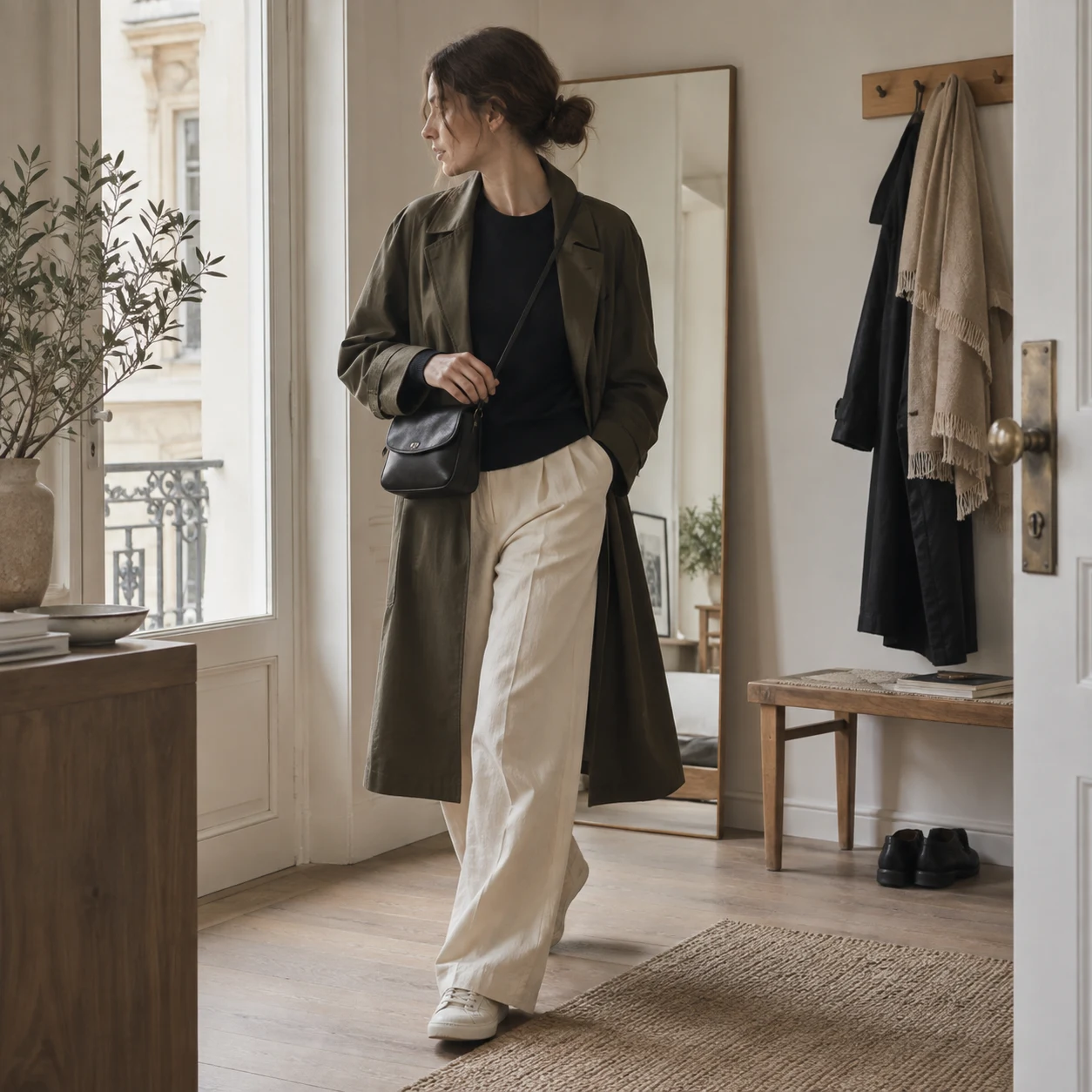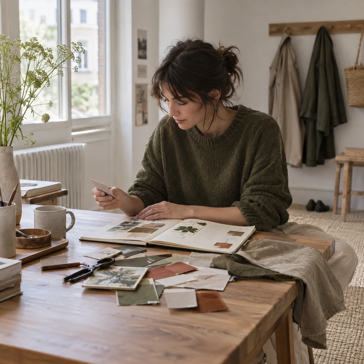
Look at the background
A leaf appears differently against pale stone than against a dark doorway. The surrounding area is part of the colour impression. Write down both the focal shade and what sits beside it. This makes the observation easier to translate into an outfit, where no colour is worn in complete isolation.
Notice the proportion
A small warm detail in a mostly cool scene can feel balanced precisely because it is small. Recreating the same palette in equal blocks may change the effect completely. Sketch rough areas or use simple words such as dominant, supporting and accent to keep the proportion visible.
Include the surface
Wet pavement, brushed metal and rough brick handle light differently. Clothing does too. When translating an observation into fabric, look for a comparable surface relationship rather than an exact digital colour value. A textured neutral may matter more than finding a mathematically identical shade.
Try one combination
Use existing clothing to test the idea on an ordinary day. A study becomes useful through wearing, not through a perfect mood board. Keep the parts that feel natural and leave the rest in the notebook. The walk has already done its work by helping you notice something familiar more carefully.