


 View study ↗
Still-image study
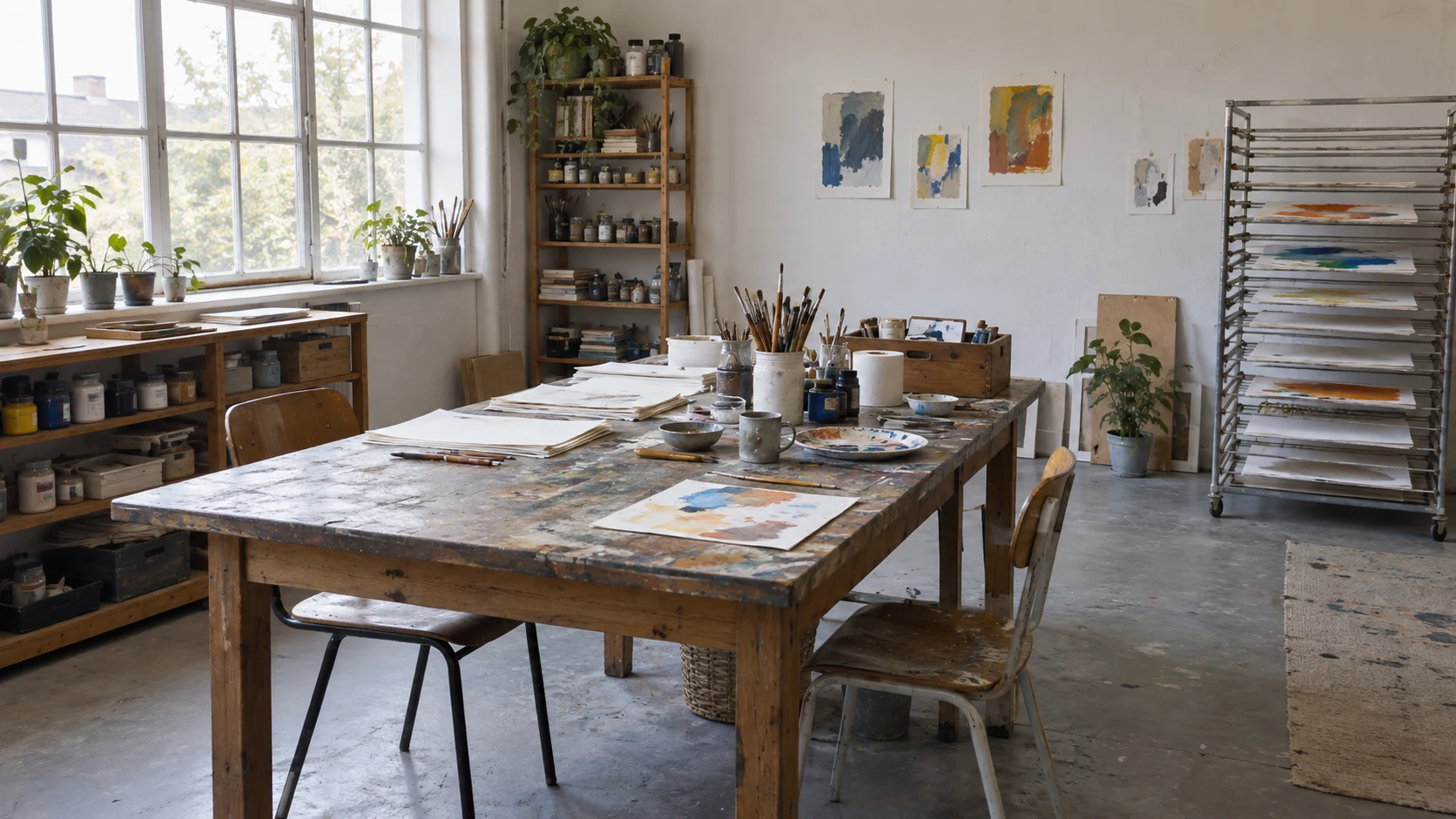
When a stripe turns a corner
Follow one colour band across a room corner and onto the floor. The turn changes how an interval appears even when its painted structure remains legible.
Artist · Ternform Gallery
Featured exhibition
—
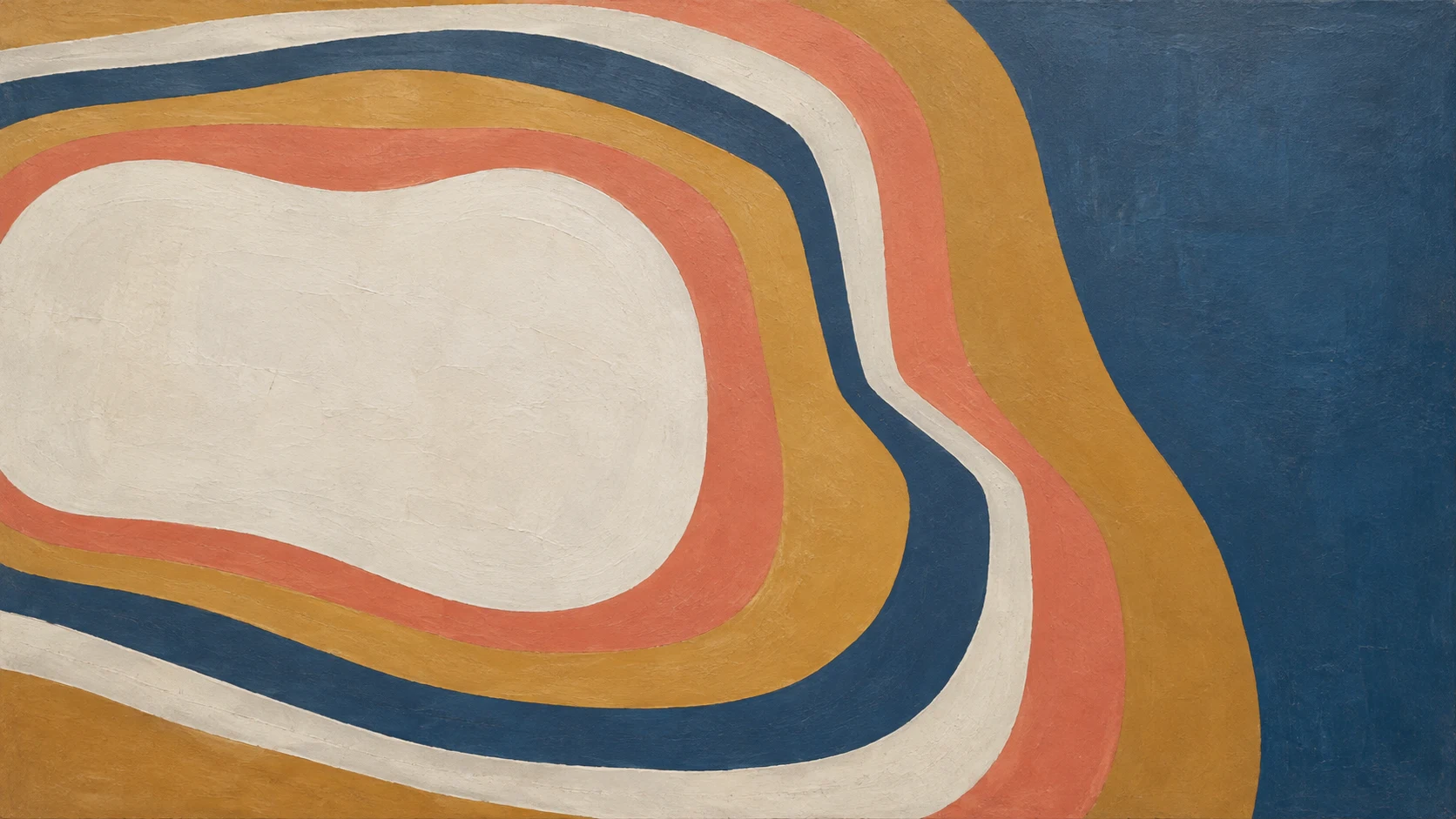
Ivo Selden's nested colour bands turn a simple structure into an extended looking exercise. Follow the edges around a corner and discover how repetition can make a small change of interval feel unexpectedly consequential.
Explore the exhibitionIvo Selden works with repeated colour boundaries: nested bands, turning corners and the suggestion of a fold. His images often seem immediately clear from a distance, then become less settled as the viewer follows a particular edge. A shape that appeared flat can begin to suggest depth; a bright passage can make the neighbouring ground look darker without changing its colour. Selden treats these shifts as the substance of a painting rather than an effect added after composition.
His studies begin with a small number of intervals. He draws a curve, places another at a measured distance and then deliberately breaks that distance at one point. The change may be slight, but it alters the rhythm of the whole arrangement. Working notes record which boundaries were taped, which were painted freely and which were revised after the surrounding colour had dried. Selden does not use these notes to establish a hierarchy of tidy and untidy work. They help him understand why a particular edge feels abrupt, elastic or uncertain when the same image is seen at a different size.
Afterlight Hours explores the apparently straightforward structure of nested bands. Colour Holds, a later programme entry, moves toward folded-looking surfaces and areas of reflected light. The two exhibitions share a concern with intervals, but give the viewer different kinds of orientation. One offers repeated routes to follow. The other lets a route disappear into a dark area before returning somewhere less expected, leaving the eye to make its own connection.
Selden's practice is well suited to a patient comparison between two views. He may ask what happens when a painting is approached from the side, or when a small study is placed beside a larger version. He is wary of assigning a fixed mood to a colour before the surrounding relationships have been considered. At Ternform, that attitude becomes an invitation to look again rather than a promise of optical spectacle. A useful exercise is to choose a narrow band, follow its whole length and describe where it seems to gain or lose weight without resorting to the name of its colour.
Short exercises for a slower look. Open a study to read the full note; its original accompanying illustration is forthcoming.
View study ↗Still-image study
Follow one colour band across a room corner and onto the floor. The turn changes how an interval appears even when its painted structure remains legible.
 View study ↗
Still-image study
A yellow Y is readable almost immediately. Set the letter aside briefly and examine three connected shapes, their surrounding intervals and the edge of the blue field.
View study ↗Still-image study
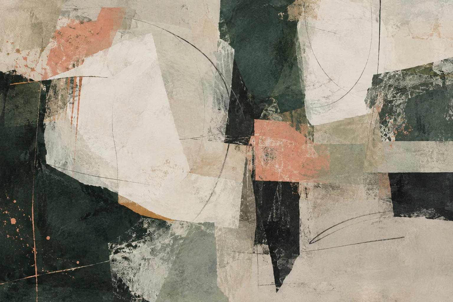
Pink and dark streaks repeatedly gain and lose their boundaries. Compare one changing edge with the more measured intervals of a nested colour arrangement.
View study ↗Still-image study
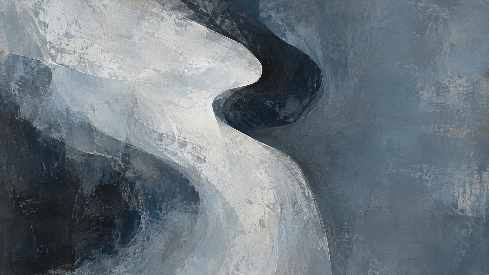
A dark marbled form seems to hang above a pale ground. Inspect the lower edge and separate a visible contrast from the physical support your reading imagines.
Three editorial recommendations with related questions. Artist subjects are identified in each story; a recommendation does not imply the artist appears in it.
Field drawing becomes a conversation between what is in front of the artist and what remains after leaving. Leyla Mott explains the gaps she keeps.
Read the storyA proposed screen visit uses a room plan, still details and pauses to build an account of work in progress without pretending to replace the room itself.
Read the story· News
From a paper sketch to a lit three-dimensional scene, a small modelling exercise reveals how geometry, surface and viewpoint can pull an image in different directions.
Read the storyDates and status use the edition date, 8 September 2026.
—
Ivo Selden's nested colour bands turn a simple structure into an extended looking exercise. Follow the edges around a corner and discover how repetition can make a small change of interval feel unexpectedly consequential.
—
Folded-looking colour fields extend Ivo Selden's enquiry into edges and intervals. Highlights suggest ridges and darker passages imply support, asking how much of an apparent surface is visible and how much a viewer supplies.