Twenty-seven still-image studies offer particular ways into a surface, a gesture or an arrangement. Each has a complete local note; none is a film or an attribution of the reference image to a fictional artist.
Original artwork for the fictional exhibition Drift Instructions.
The pale blue and pink swirls offer a route that repeatedly changes its apparent depth. Begin where a light passage meets a darker one and follow the boundary without naming the form. At one point it may resemble a ridge; elsewhere the same kind of line can seem to open into a hollow. The interest lies in that change of reading, which is available even before the image has been identified as a particular kind of object or material.
Try tracing the route once with your eyes and then describing its first interruption. This is a still-image looking exercise associated with Mira Venn's practice, not a recording of the artist at work.
Original artwork for the fictional exhibition Drift Instructions.
A recognisable flower changes the way an otherwise loose painted field is read. The pink petals establish a centre quickly, while the surrounding dark leaves and pale ground supply a less definite set of edges. Compare the certainty of the flower's outline with the passages in which one colour seems to lose its boundary. The image can be discussed as an arrangement of marks without denying the subject that first made it recognisable.
Look away briefly, then return to a part of the ground instead of the flower. Notice how much of the composition becomes available through that smaller, less obvious point of entry.
Original artwork for the fictional exhibition Drift Instructions.
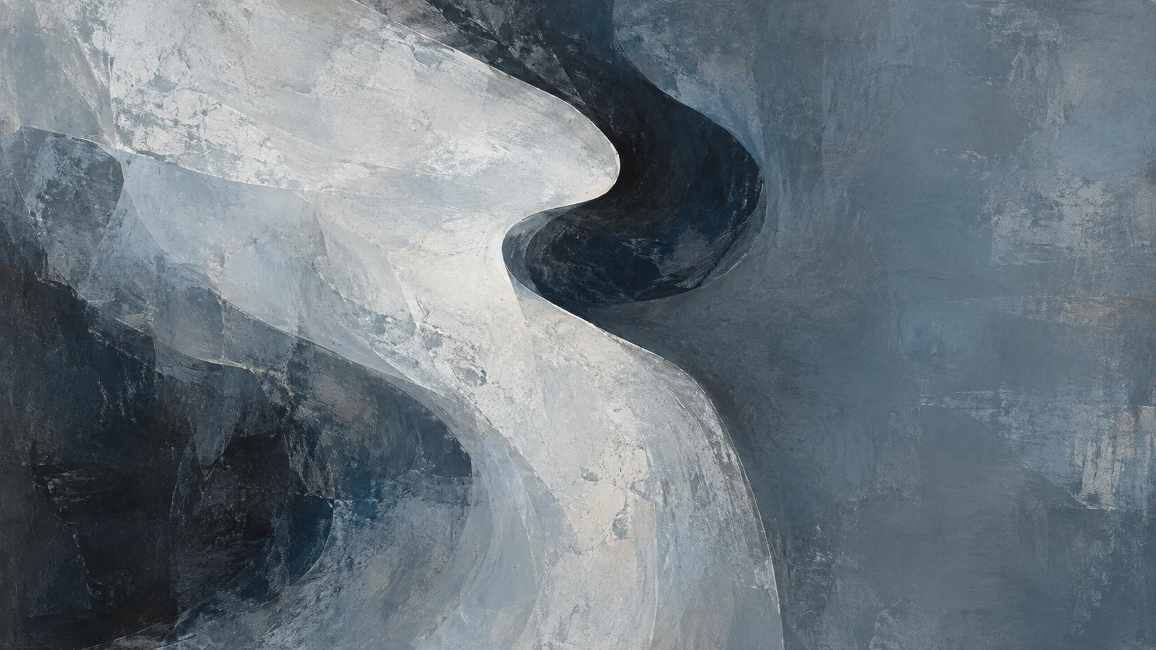
Grey, blue and white passages create an impression of movement without showing a moving object. A pale area seems to push forward partly because the adjacent dark fold recedes. The comparison is useful for Mira Venn's concern with orientation: the apparent direction belongs to a relationship between marks, not to a label such as cloud or cloth. Neither label needs to be correct for the surface to offer a convincing route through it.
Find the point where the broadest pale form narrows. Decide whether the narrowing feels like a turn, a pause or a disappearance, and point to the edge that supports your description.
Original artwork for the fictional exhibition Drift Instructions.
The pale blue image has a sharply changing boundary that can suggest ice, a cut surface or a sculptural fold. Its appearance alone does not establish which material or process produced it. Set that uncertainty aside and examine how the narrow darker passage connects two larger areas. It creates a division, but also gives the eye a way to travel between parts that might otherwise seem separate.
Compare this route with the broad billowing study. Both can organise attention through contrast, yet one feels compressed and the other expansive. The difference can be described through width and direction before any imagined subject is introduced.
Original code-authored artwork for this fictional gallery edition.
A bright pink covering makes a familiar white bust seem newly difficult to read. The shape of the head remains available while much of the facial information is withheld. Look at the edge where the covering meets the form beneath it: a small fold can become more conspicuous than the large sculptural contour. This reversal offers a concrete starting point for the questions of hierarchy and display explored in Jonas Pell's practice.
The image is an illustrative reference, not an authenticated work by Pell. Describe the covering through its visible colour and translucency; its appearance is insufficient evidence for a precise material or environmental claim.
Original artwork for the fictional exhibition Afterlight Hours.
The blue-covered head sits above a supporting base. The base might seem secondary, but it establishes an important interval between the object and everything below it. Cover the lower part of the image with your hand for a moment, then reveal it again. The change can make it easier to notice how display gives an object a different apparent weight and status without altering the object itself.
This exercise belongs to Soft Monument's question about the practical parts of an arrangement. The pedestal is not merely where looking stops after the main subject has been identified; it is one of the conditions that makes that subject prominent.
Original artwork for the fictional exhibition Drift Instructions.
A real hand holds a white sculpted hand above a wooden floor. The two forms share a recognisable structure but have different surfaces, weights and roles within the photograph. One supports; the other is supported. Begin with the contact between them, then compare what the image lets you infer about pressure. An impression of delicacy does not establish the actual weight or material of the sculpted object.
The still is used here as a comparison for Jonas Pell's interest in handling and display. It does not document a transaction, a collaborative project or the ownership of the pictured object by Ternform.
Original generated artwork for this fictional gallery edition.
A hand meets a bust through a translucent covering. The point of contact brings together three different kinds of boundary: the outline of the hand, the fold of the covering and the harder-looking sculptural form beneath it. Look for the places where those boundaries coincide and where they separate. Small differences can change whether the covering seems to protect, conceal or draw attention to the object.
No single interpretation has to describe every part of the image. The purpose of the study is to make an initial reading more specific by connecting it to a visible contact, fold or change of surface.
Original generated artwork for this fictional gallery edition.
Projected-looking shapes and coloured light cross a close face portrait. Before describing the person's expression, list the brightest and darkest areas in the frame. Some belong to the face's contours; others appear to arrive from the lighting arrangement. The distinction helps separate visible conditions from assumptions about the person. It also gives a practical entry into Elin Rook's concern with how a portrait is constructed around its subject.
The pictured person is not identified as Rook. This is a still reference used to examine framing and light, not evidence of a fictional sitter's feelings, biography or participation in a gallery event.
Original artwork for the fictional exhibition Drift Instructions.
Two pale hands form a delicate shape against a pink field. The background supplies very little setting, so the interval between the fingers acquires unusual importance. Examine that empty area as if it were another shape in the composition. Then compare it with the visible contours that surround it. The gesture may remain familiar, but its apparent meaning can change when the negative space becomes the centre of attention.
This study extends a conversation about staged imagery beyond the face. It asks how a small arrangement can guide a viewer's reading without providing enough information to infer a complete action or personal story.
Original generated artwork for this fictional gallery edition.
The painted figure is quickly recognised through its face and joined hands, but the narrow gaps around the fingers deserve a slower look. Follow one gap until it meets the surrounding painted field. Its role may change from part of a bodily gesture to a division between light and dark shapes. Cassian Vale's Gesture Ledger uses this kind of transition as a way to discuss how recognition is built from local decisions.
The mural remains a separately sourced visual reference. The study concerns its visible relationships and does not attribute the pictured work, its location or its original intention to the fictional artist.
Original code-authored artwork for this fictional gallery edition.
A large turquoise eye occupies a wall, changing the scale at which a small facial feature is normally encountered. Start at the outline rather than the pupil. Surface marks and changes in the wall can make that contour less continuous than it first appears. The feature remains readable despite those interruptions, which offers a useful comparison with the smaller gestures discussed in Cassian Vale's profile.
Ask what information is essential for recognition at this size and what becomes newly visible because of enlargement. This is an exercise in looking at an existing reference image; it does not supply a proposal to paint an unpermitted wall.
Original generated artwork for this fictional gallery edition.
The multicoloured field moves across a dark wall without providing the same clearly drawn body as the neighbouring figurative study. Follow a bright passage and notice where it is absorbed by the surrounding surface. An image can suggest turning or pressure through that relationship without representing an arm or hand. The comparison helps explain the question connecting Gesture Ledger with Ordinary Spectra, while preserving their distinct subjects.
Avoid deciding too quickly whether the passage is energetic or calm. First identify the mark, gap or contrast that produces that impression. A more precise description leaves room for another viewer to test the same evidence.
Original generated artwork for this fictional gallery edition.
A hand holds a yellow sculpted head, making the difference between an image of a person and a handled object immediately visible. The colour draws attention first, but the supporting fingers provide a useful measure of scale. Compare the head's outline with the hand beneath it. The arrangement invites a reading of gesture through support and balance rather than through a painted expression.
This reference was selected as an object study. It is not a portrait of Cassian Vale, an authenticated artwork by him or an item offered for sale. Its value here is the particular relationship between a hand, a coloured form and an open surrounding field.
Original artwork for the fictional exhibition Afterlight Hours.
Colour bands run across a room corner and floor, requiring the eye to negotiate a change of plane. A stripe that seems evenly paced on one wall can acquire a different apparent width as it turns. Begin with a single band and keep following it through that change. The architecture supplies information that a flat crop might conceal, making this a useful comparison for Ivo Selden's interest in intervals.
The room is a visual reference, not a documented Ternform installation. Notice which part of its apparent depth is explained by perspective and which part is intensified by the neighbouring colours.
Original code-authored artwork for this fictional gallery edition.
A large yellow Y occupies a dark blue square. Recognition is immediate, which makes it easy to overlook the distribution of space around its branches. Temporarily treat the letter as three connected areas. Compare the intervals between them and the surrounding edge of the image. The composition can be examined through balance and contrast before the letter is returned to its role as a readable sign.
This is a study of the pictured artwork's structure, not an original Ternform logo or a symbol adopted by Ivo Selden. The distinction keeps looking at typography separate from claiming its design as a new identity.
Original artwork for the fictional exhibition Afterlight Hours.
Pink, cream and dark streaks travel through a square field. Some boundaries remain sharp enough to follow, while others blur into neighbouring passages. Choose one that changes character along its length. The difference between a firm edge and a spreading one can suggest pressure or speed, but the image does not verify a particular making technique.
Compare the streak with the measured-looking bands in Afterlight Hours. Both organise an interval; they make different promises about how steadily it can be followed. This exercise is associated with Selden's practice as a comparison of structures, not a claim that the reference image was made by him.
Original artwork for the fictional exhibition Afterlight Hours.
A dark marbled form appears to hang over a pale field. Its apparent weight depends partly on the empty area around it and partly on a changing lower boundary. Follow that boundary and identify where the form seems most firmly supported by the composition. The answer may have little to do with a physical support, because the picture supplies visual relations rather than a complete account of an object in space.
The study connects with Colour Holds through the question of how a surface can imply a fold or suspended mass. Naming the visible contrast first keeps those useful comparisons distinct from unsupported statements about material or process.
Original generated artwork for this fictional gallery edition.
A colourful mural covers a building with a red door. The door is both a practical opening and a compositional interruption. Look at the painted passages that approach its edges: some may seem to acknowledge the opening, while others continue as though a flat field were available. That tension gives Nora Fen's interest in public language a material setting, even where the visible reference is not organised around a single word.
The building is not identified as a Ternform venue or a project by Fen. The looking task is to consider what an existing use of a surface contributes to an image placed upon it.
Original generated artwork for this fictional gallery edition.
Bright block letters occupy a darker interior. The first readable fragment may organise the whole image for a moment, but other edges compete for attention. Read what you can without supplying missing words, then look at the same area as overlapping colour shapes. The difference between those two passes shows how legibility can direct a viewer before the rest of a composition has been considered.
Public Second Thoughts asks related questions about certainty and address. This study does not translate unverified text or assign its message to Nora Fen. It concentrates on how the act of reading changes the route an eye takes through a particular image.
Original generated artwork for this fictional gallery edition.
A graphic face in red, yellow and black is painted over brick. The masonry remains a visible grid beneath the image, creating another set of edges to follow. Compare a painted contour that runs with the brickwork to one that cuts across it. The face can remain clear while the wall continues to insist on its own pattern and physical divisions.
For a practice concerned with public surfaces, that double reading is useful. It prevents the support from becoming an invisible backdrop for a message. The photograph remains an illustrative reference; its presence here establishes neither authorship by Nora Fen nor permission for a new intervention at the pictured site.
Original code-authored artwork for this fictional gallery edition.
Blue and violet ridges create a surface in which different directions meet. Begin with a longer stroke and examine the smaller marks that interrupt it. Some appear to sit above a neighbouring passage; others may expose an earlier layer. The image can suggest a sequence, but a suggestion is not enough to reconstruct every action that made the surface.
Ada Lorne's Ground Register keeps that limit visible. Try describing the pressure implied by a particular edge, then identify what remains uncertain about it. The exercise gives both observation and uncertainty a place in a discussion of a painting's material history.
Original artwork for the fictional exhibition Afterlight Hours.
The pink, purple and yellow surface contains narrow scratches among broader passages. A small exposed line can interrupt a large colour area more sharply than another broad brushstroke would. Find one such line and compare the colours immediately beside it. The interruption may make an underlying layer newly important even when very little of that layer can be seen.
This reference supports a looking exercise rather than a verified technical account of the work. It is enough to describe the visible change in surface without naming an implement, drying time or sequence that the image cannot establish.
Original artwork for the fictional exhibition Afterlight Hours.
Thick-looking blue passages are crossed by orange and red marks. The brighter colour attracts attention quickly, but its force depends on the area surrounding it. Look at the blue immediately beside the mark before moving outward to the rest of the image. A local change of tone or direction can make the bright interruption seem more firmly placed than it would on a uniform ground.
Ground Register uses this relation as an entry point into a larger discussion of accumulated surfaces. The reference is not authenticated as a work by Ada Lorne; the study concerns the specific contrast available to a viewer here.
Original artwork for the fictional exhibition Afterlight Hours.
A back-view head and shoulders are crossed by thick blue lines. The image puts a recognisable figure and a drawn intervention into the same field. Follow a line that moves across the body's outline, then compare a section where it stays within the figure. Its role changes at the boundary, even though the colour and width of the line may remain similar.
The comparison expands Ada Lorne's concern with layers beyond a single painted surface. It also marks a limit: the image does not explain the depicted person's identity or the circumstances of the intervention, so the study does not invent either.
Original artwork for the fictional exhibition Afterlight Hours.
A painted figure with raised arms and a turquoise head wrap occupies a grey block wall. The pose is legible at a glance, while the wall's divisions create a slower set of interruptions. Compare the space enclosed by the arms with the areas outside them. The empty shapes can make the gesture feel open or compressed without adding information about the figure's intention.
This still study is associated with Suri Calder's interest in recognition. The mural is not attributed to her, and its pose is not treated as evidence of a particular person's feelings. The discussion remains attached to the visible arrangement.
Original code-authored artwork for this fictional gallery edition.
The close painted face is divided into saturated colour areas and emphatic dark contours. One feature may draw the eye first, but the surrounding fragments quickly compete with it. Try describing the largest colour shapes without using the names of facial features. Then return to eyes, mouth and outline and see how recognition reorganises those same shapes.
Faces in Common explores this movement between an image's structure and a viewer's assumptions. The exercise does not require either reading to defeat the other. It asks how much can change when attention moves from recognising a face to examining the particular marks through which that recognition occurs.